If you’ve spent any time in quilting circles lately, you’ve probably heard the term “low volume” tossed around like everyone was born knowing what it means. Don’t worry — it’s one of those phrases that sounds far more technical than it actually is. By the end of this post, you’ll know exactly what low volume fabric is, why it quietly does some of the hardest work in a quilt, and how to start using it with confidence.
Let’s settle in. Grab your coffee. This is the kind of thing that’s lovely to understand once and then carry with you through every project afterward.
So, what does “low volume” actually mean?
In the simplest terms, low-volume fabric is fabric with very little visual contrast. The print is there, but it’s soft, pale, and quiet. Think cream, ivory, oatmeal, and gentle tan, often with a small-scale pattern printed in a tone just a shade or two darker than the background. From a few feet away, these fabrics “read as almost solid,” to borrow a phrase quilters use constantly.
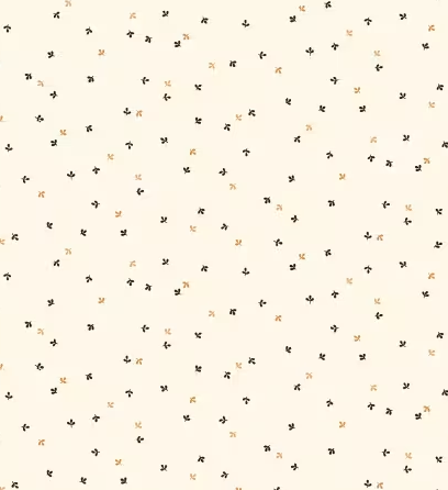
That “reads as almost solid” quality is the whole point. A low volume fabric gives you the gentle texture and warmth of a print without the busyness. It whispers instead of shouts.
Compare that to a high-contrast fabric, a navy with bright white polka dots, which immediately grabs your eye. Low-volume fabrics are the opposite. They recede. And in quilting, having fabrics that know how to recede is every bit as valuable as having fabrics that pop.
Why low volume fabric matters more than people think
Here’s the part that surprises newer quilters: the background of a quilt does an enormous amount of emotional and visual work, and most people never consciously notice it.
When you choose a flat, pure-white solid for your background, your quilt can feel crisp and modern, but it can also feel a little cold or clinical. When you swap in low-volume prints instead, something softer happens. The faint texture of tiny sprigs, little X’s, scattered arrows, and tonal patterns gives the eye somewhere gentle to rest. The quilt feels warmer, more vintage, more handmade, more like something that belongs on a farmhouse bed than in a showroom.
This is exactly why low-volume fabrics are beloved in primitive, reproduction, and traditional quilting. Those styles lean into a cozy, lived-in, heirloom feeling, and a quiet cream background is what makes the feature fabrics like your reds, your indigos, and your cheddar golds shine without the whole composition turning chaotic.
In other words: low volume fabric is the supporting actor that makes the star look good.
Where to actually use low volume fabric in a quilt
If you’re wondering where these soft cream prints belong in a project, here are the four roles they play best:
1. Backgrounds: This is the headline use. A low-volume background lets pieced blocks float and breathe. It unifies a scrappy quilt full of busy prints, giving the eye a calm field to travel across.
2. Fillers and negative space: In blocks with open areas, low-volume prints fill space without competing for attention. They add subtle interest where a flat solid might feel empty.
3. Borders: A low-volume border frames a quilt softly. It draws the boundary without slamming a hard line around your work, which keeps the overall feeling gentle and cohesive.
4. Sashing: The strips that separate your blocks are prime low volu-me territory. Quiet sashing lets each block stand on its own while still tying the whole quilt together.
Notice the theme running through all four: low volume fabric creates calm. It’s the connective tissue of a quilt.
The trick to building a good low volume collection
Here’s where a lot of quilters get a little stuck. You can’t just grab any six cream fabrics off a shelf and assume they’ll play nicely together. Creams are sneaky. One leans pink, another leans yellow, and a third leans gray. When lined up next to each other, those undertones can clash in ways that are hard to predict until the fabric is already in your project.
The reliable approach is to collect low-volume fabrics in coordinated groups where someone has already done the work of making sure the undertones harmonize. The prints should vary in scale and motif — some tiny dots, some little sprigs, some linear textures while staying in the same gentle tonal family. That variety is what keeps a low-volume background interesting up close while still reading as calm from across the room.
This is precisely why curated bundles exist, and why they’re such a sane place to start.
A simple, ready-made way to start: the Kim Diehl Low Volume Bundle
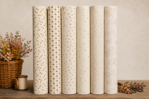
If you’d like to skip the guesswork, the Kim Diehl Low Volume Half Yard Bundle is a lovely entry point. It’s a set of six half-yard cuts (approximately 18″ x 44″) of coordinated cream-and-tan low-volume fabrics — already chosen to work together so you don’t have to second-guess the undertones.
A few details worth knowing:
- It’s 100% quilt-shop-quality cotton by Kim Diehl for Henry Glass, a designer-and-manufacturer pairing well known in the traditional and primitive quilting world.
- The prints are exactly the kind described above: tiny sprigs, little X’s, arrows, and tonal textures that read as almost solid, so they bring quiet character rather than noise.
- The half-yard size is genuinely useful: half a yard gives you enough fabric for backgrounds, multiple blocks, sashing, or borders, with room to spare, which is more flexible than a fat quarter for these supporting roles.
Half yards are a bit of a sweet spot for background fabric, because background is exactly where you tend to need more yardage than you first expect.
How much low volume fabric do you actually need?
A fair question, and the honest answer is “more than you’d guess.” Because low-volume fabric so often becomes the background — the largest single area in many quilt designs — it gets used up faster than your feature prints.
A half-yard cut is a comfortable amount for sampling a fabric across several blocks, piecing a modest background, or cutting sashing strips. Having six coordinated half-yards on hand means you can mix and rotate them throughout a quilt for that gently scrappy look, rather than relying on a single fabric for every inch of background. And if you fall in love with one and need more, Kimberly’sFabricStash offers continuous-length cuts and custom orders, so you’re not stranded mid-project.
A few beginner-friendly tips for working with low volume
Since this blog is about helping you actually use what you buy, here are a handful of small lessons that make a real difference:
- Audition your fabrics together before cutting. Lay all six side by side in daylight. Daylight reveals undertones that lamplight hides.
- Vary the print scale on purpose. Place a tiny dot next to a slightly larger sprig next to a linear texture. That gentle variety is what keeps a low volume background from looking flat.
- Don’t be afraid to mix them within one background. A scrappy, low-volume background of several different creams pieced together is a hallmark of the primitive and reproduction look, and it’s far more forgiving than trying to match one fabric perfectly.
- Press, don’t iron aggressively. Quilt cottons behave best with a gentle press; dragging a hot iron can distort the weave.
The quiet fabric that makes everything else shine
Low-volume fabric is one of those concepts that, once it clicks, changes how you look at every quilt you make. It’s not flashy. It doesn’t ask for attention. But it’s the calm, warm foundation that lets your feature fabrics do their thing, and a coordinated set of creams is one of the most reusable, dependable things you can keep in your stash.
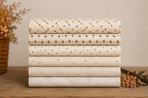
If you’re ready to start building yours, the Kim Diehl Low Volume Half Yard Bundle gives you six harmonious cream-and-tan cuts in one go as a tidy, no-guesswork foundation for your next primitive or traditional quilt. It ships from Pennsylvania, usually the same or next business day, with free shipping on orders over $35.
Happy stitching. Your backgrounds are about to get a lot more interesting — quietly.
A: Low-volume fabric is fabric with very little visual contrast — typically cream, ivory, or pale tan with a small-scale print in a slightly darker tone. From a short distance, it reads as almost solid, providing a gentle texture without visual busyness, making it ideal for quilt backgrounds.
It’s used primarily for backgrounds, fillers, and negative space, borders, and sashing. Its quiet, low-contrast quality lets feature fabrics stand out while keeping the overall quilt calm and cohesive.
Cream fabrics have undertones that can clash unexpectedly. A curated bundle gathers fabrics whose undertones already harmonize and whose prints vary in scale, so they work together reliably without guesswork.
The bundle includes six half-yard cuts, each approximately 18 inches by 44 inches, in 100% quilt-shop-quality cotton by Kim Diehl for Henry Glass.
Yes. KimberlysFabricStash offers continuous-length cuts and custom orders on request, so you can get additional yardage if a project needs it.
